The Secret to a More Interesting Wardrobe Is These 5 Unique Colors That Behave Like Neutrals
Our take
The fashion landscape is perpetually evolving, and the latest whisper of change revolves around a subtle yet significant shift in how we approach color. Anna Baldwin, in her recent piece for Who What Wear, illuminates the rise of "-ish" colors – those intriguing shades that exist beautifully between established neutrals and bolder hues. It's a clever reframing, recognizing that many of us crave versatility in our wardrobes, the ability to build outfits that are both timeless and quietly distinctive. We’ve seen this desire reflected in the broader trends we’re tracking, like the enduring appeal of It's Official: These Are the 5 Elegant Summer Dress Trends All Over the High-Street Right Now, proving that a certain level of understated elegance is always in demand. This isn't about chasing fleeting trends; it’s about cultivating a wardrobe that feels inherently *you*, a collection of pieces that work together harmoniously and reflect a considered aesthetic. The "-ish" color concept offers a compelling framework for achieving precisely that.
The genius of this approach lies in its accessibility. Traditional neutrals – black, white, beige – are undeniably foundational, but they can sometimes feel a little… predictable. Brighter colors offer excitement, but their versatility can be limited. "-ish" colors, like olive-ish green, dusty rose-ish pink, or slate blue-ish gray, provide the best of both worlds. They possess the grounding qualities of neutrals, allowing them to be mixed and matched with ease, while retaining a hint of personality and visual interest. It’s a move away from prescriptive color palettes and towards a more intuitive, personal approach to styling. Consider, for example, how a "taupe-ish" shade can function as a softer, more approachable alternative to stark gray, or how a "terracotta-ish" hue can lend warmth and depth without the intensity of true terracotta. This nuanced understanding of color is precisely what elevates a wardrobe from simply *dressed* to thoughtfully curated. Even the current fascination with trainer trends, highlighted in Hold the Sambas—I Know You're a Fashion Person If You're Wearing This Trainer Trend Instead, speaks to a desire for pieces that are both functional and subtly expressive.
This shift also aligns with a broader cultural understanding of style as an expression of individuality, rather than a rigid adherence to trends. The “just a fit” aesthetic, as showcased in Just a fit, which champions effortless, personal style, is a direct reflection of this. Consumers are increasingly seeking pieces that allow them to project a sense of authenticity and confidence, and "-ish" colors provide a subtle yet effective means of achieving this. They offer a way to signal a considered eye for style without resorting to overt displays of trendiness. It’s a quiet confidence, a knowingness that comes from understanding how to build a wardrobe that feels both timeless and personal. The focus moves away from fleeting seasonal trends toward building a foundation of pieces that resonate with a deeper sense of self.
Ultimately, the rise of "-ish" colors represents a subtle but significant evolution in our approach to fashion. It’s a move toward a more nuanced, intentional, and personally expressive style. As consumers become increasingly discerning and prioritize longevity over fleeting trends, we can expect to see these versatile shades become even more prevalent in wardrobes around the world. The question now becomes: how will designers continue to innovate within this framework, exploring new "-ish" colors and combinations that further expand the possibilities of a truly versatile and expressive wardrobe?
Anna Baldwin is a Who What Wear editor in residence and an Atlanta-based personal stylist who services men's and women's everyday wardrobes, helping clients edit, shop, and style with long-term clarity, not one-off outfits.
Some of the most versatile colors in my wardrobe are the hardest to describe. They're not quite brown, not quite gray—not exactly olive but not green either. Tibi calls these Ring 3 colors, the "-ish" shades that sit between traditional color families. Within Tibi's Color Wheel philosophy, Ring 1 and Ring 2 are home to classic neutrals like black, white, navy, gray, and brown. Ring 3 introduces the nuanced, hard-to-name colors that bridge multiple color families, while Ring 4 is where you'll find clearly defined, more saturated hues. I had spent years relying almost exclusively on Rings 1 and 2 because Ring 4 felt like too big of a leap. Ring 3 became the bridge, allowing me to incorporate more color into my wardrobe without feeling like I was stepping outside my minimalist aesthetic.
To me, Ring 3 colors soften the corners of an outfit. We know how to create high-contrast looks with black and white and tonal outfits within the same color family, but introducing a Ring 3 color creates a softer, more nuanced palette. It's a subtle shift that makes an outfit feel more sophisticated and creative.
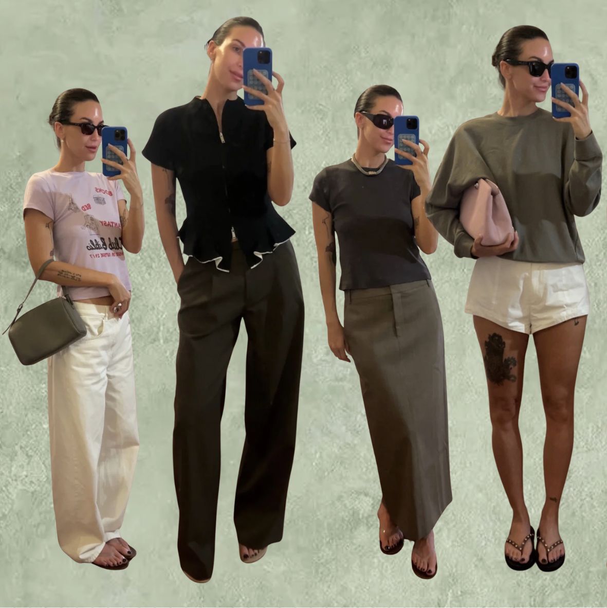
As I rarely wear bold patterns or elaborate design details, interesting color combinations have become a styling skill I've intentionally refined. Below are five Ring 3 colors I reach for most often, along with how I style them.
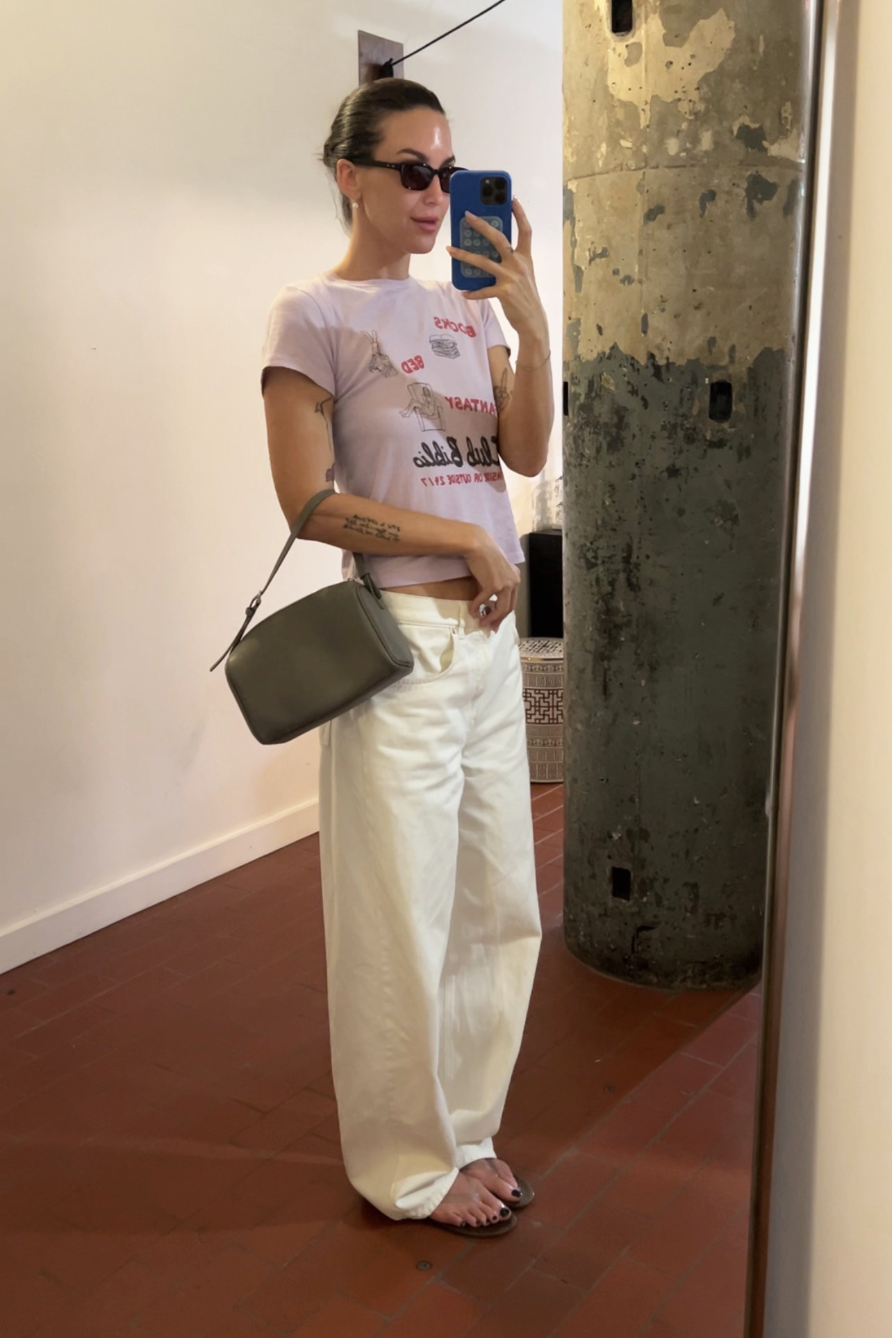
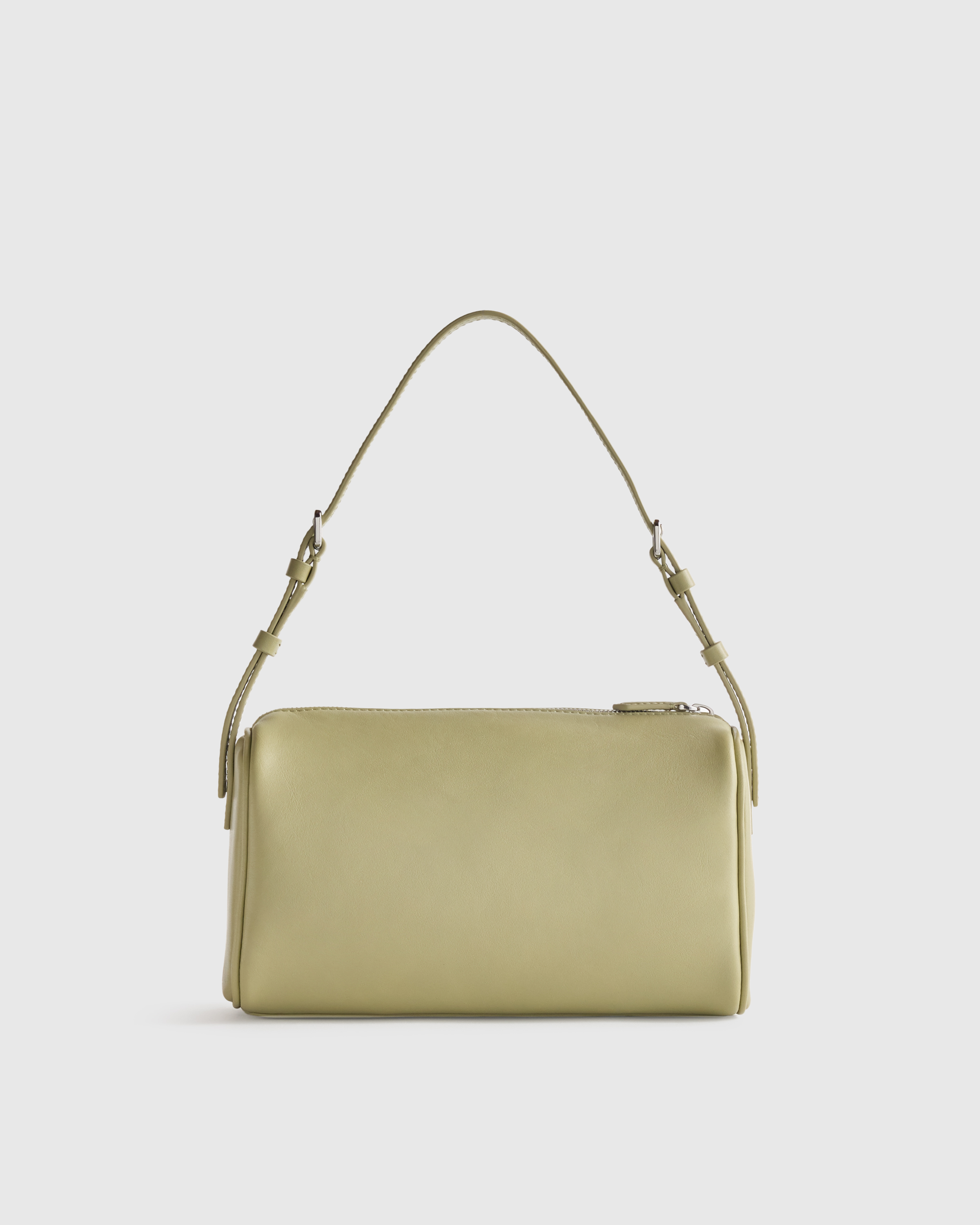
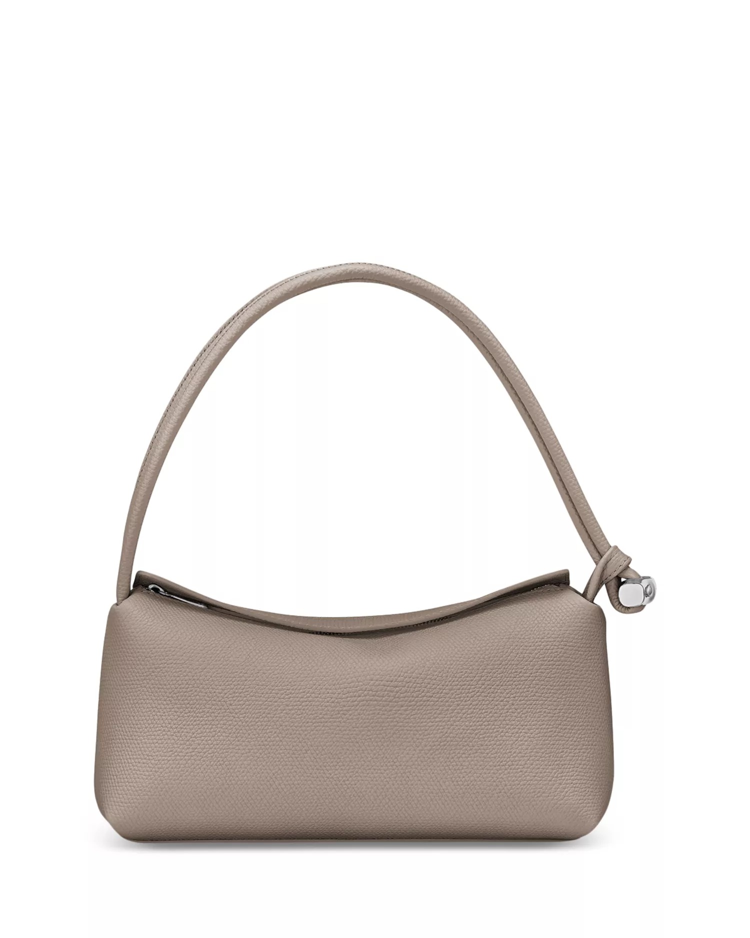
Mink
Cool greige with taupe and soft mushroom undertones
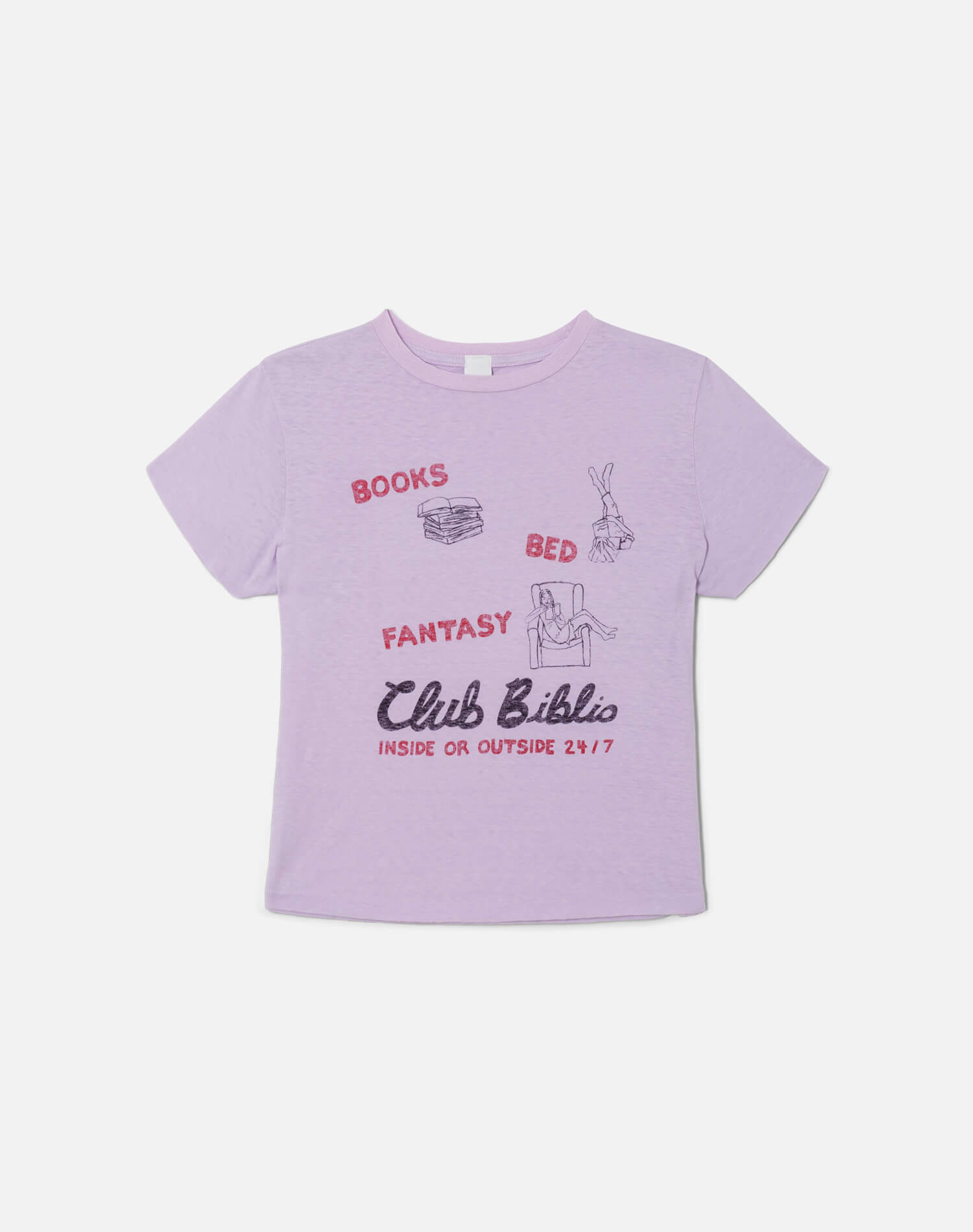
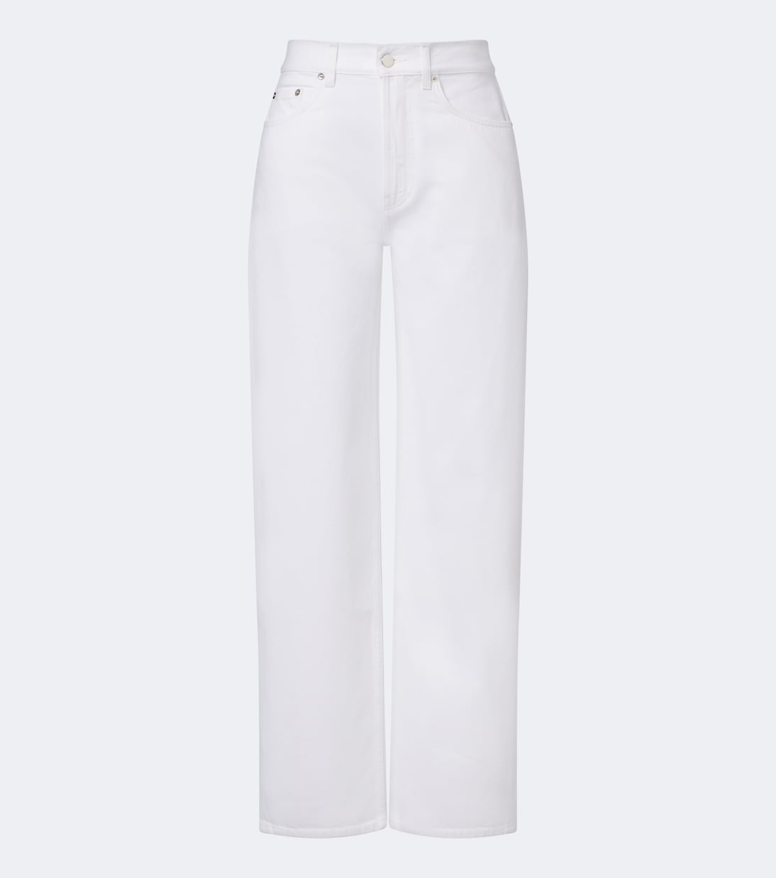
I wanted to show how this color can combine a classic neutral with a brighter hue. The optic-white jeans create a clean, high-contrast foundation, while the dusty-lilac tee echoes the softness of the mink bag without competing with it.
Shop My Look
Shop More Mink Bags
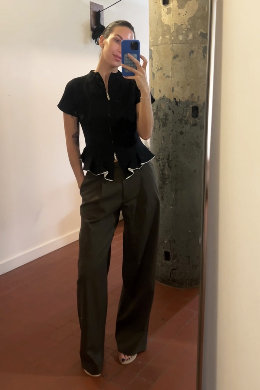
Earth
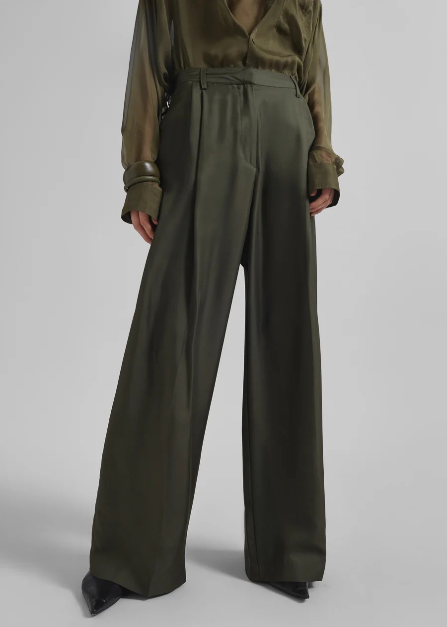
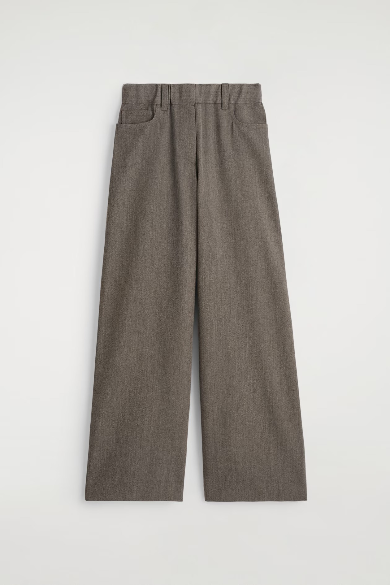
Deep olive brown with muted moss and warm gray undertones—more nuanced than olive, softer than brown
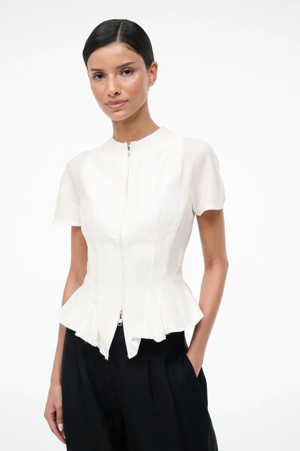
I paired the earth trousers with a black top featuring white trim to lean into a classic color palette. The earth tone softens the contrast, making the outfit feel richer and more interesting than a standard black-and-white combination.
Shop My Look
Soot
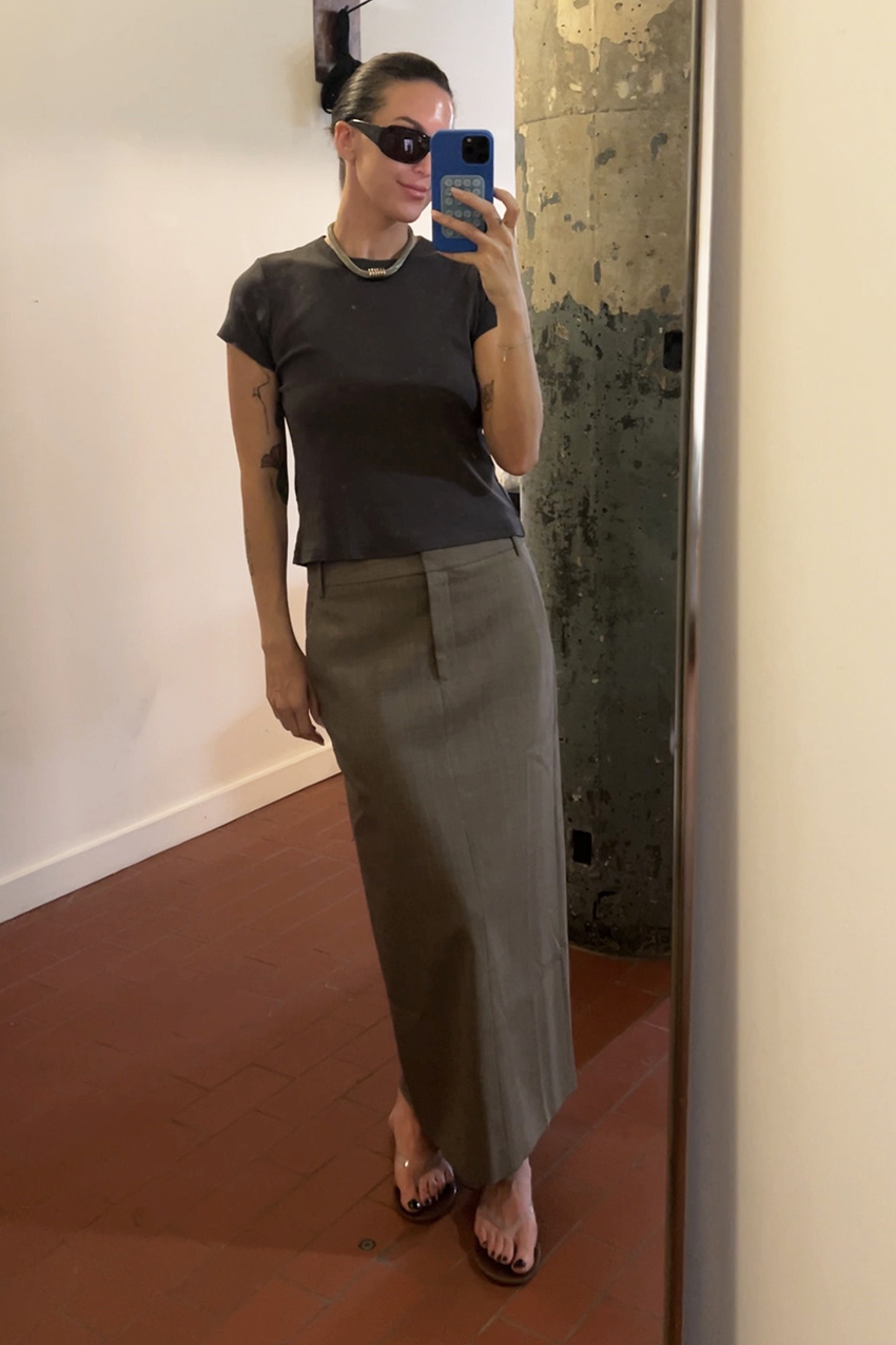
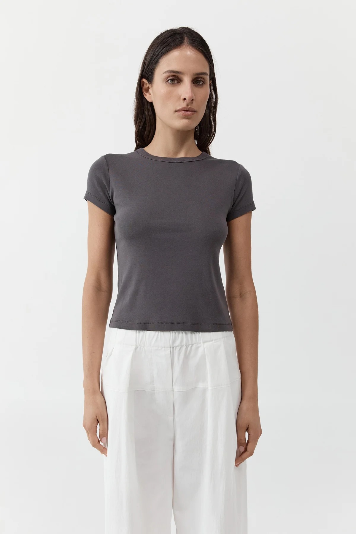
Soft charcoal with smoky graphite undertones—not quite black, not quite gray
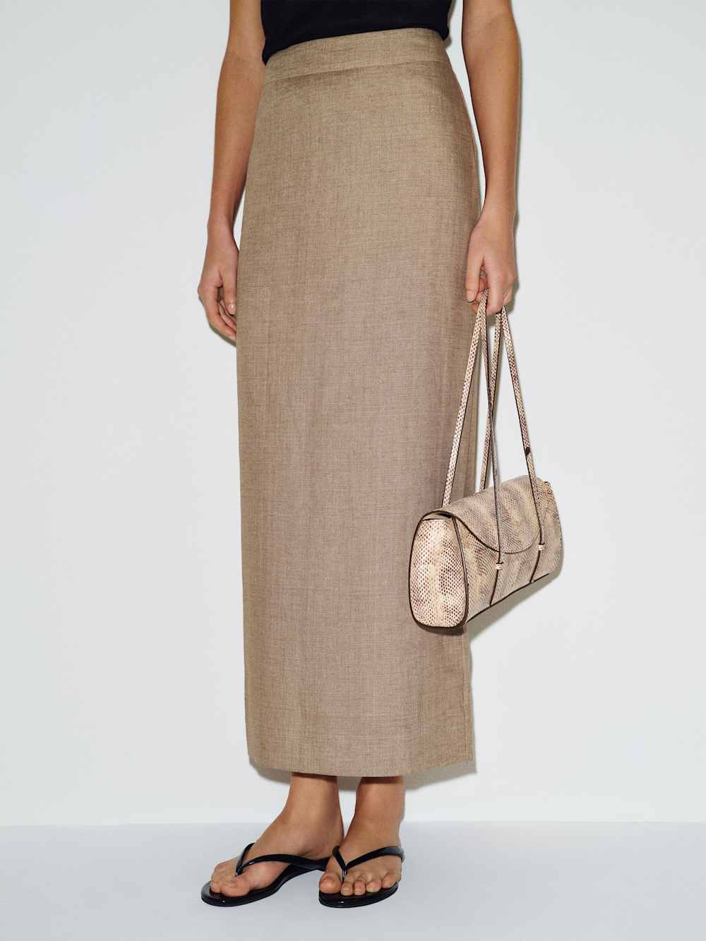
I leaned into a tonal palette with this outfit. The soot tee complements the cool undertones in the Cedar Melange skirt, creating depth without relying on black.
Shop My Look
Dark Stone
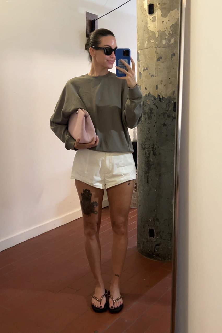
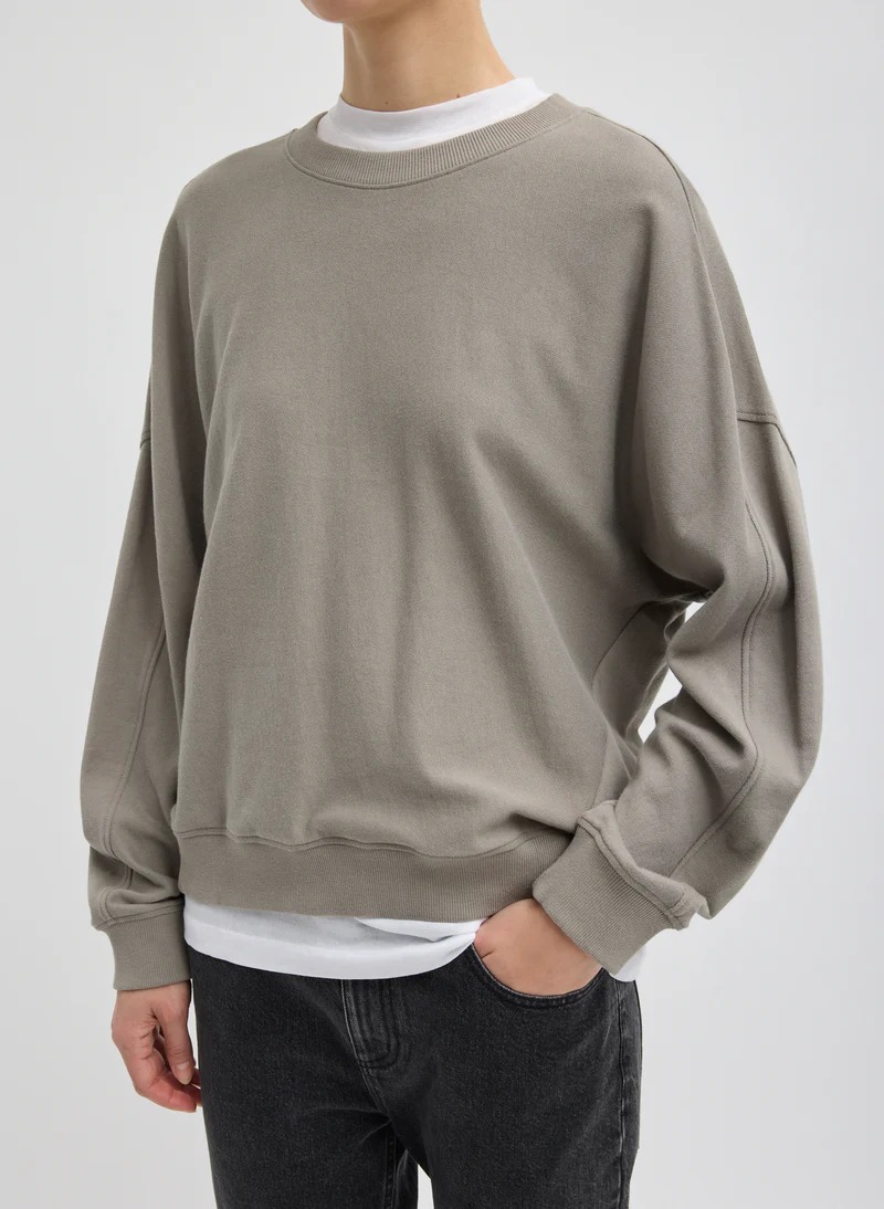
Muted olive-gray with weathered sage undertones that occupies the space between olive, sage, and stone
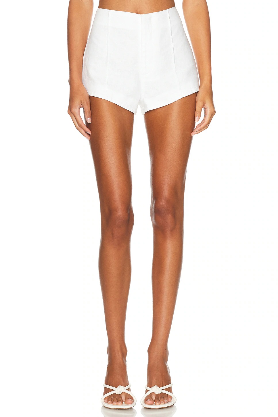
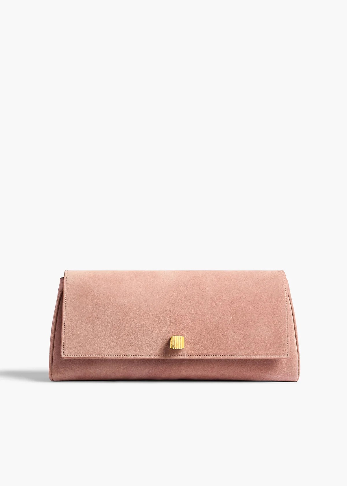
I paired the oversize dark-stone sweatshirt with crisp ivory shorts to keep the look casual while maintaining contrast. The blush bag introduces another muted color, proving that Ring 3 shades don't just pair well with classic neutrals. They also make softer colors feel effortless rather than overly sweet.
Shop My Look
Cedar Melange
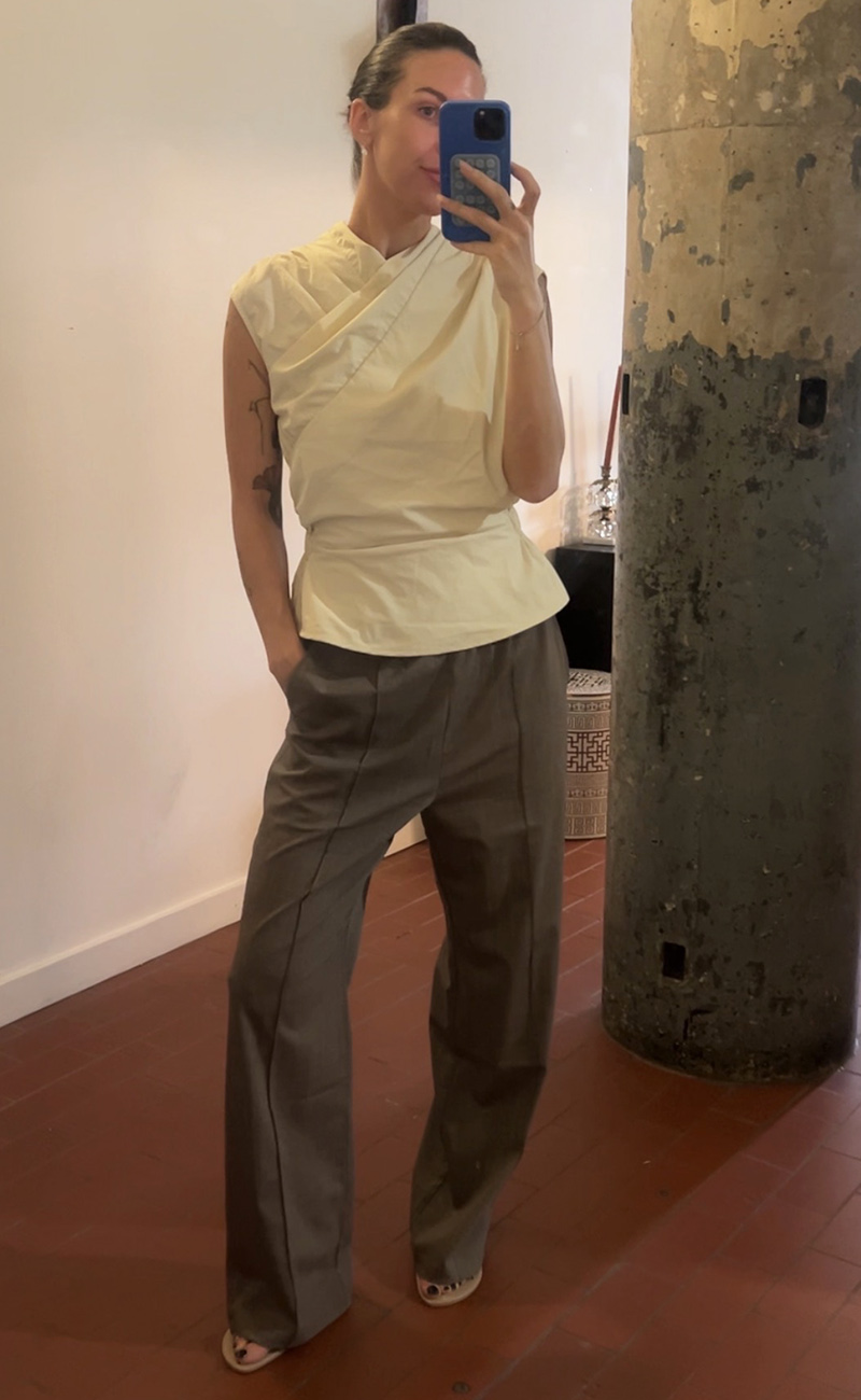
Heathered taupe with cool brown, soft gray, and creamy ivory undertones—the mélange yarn creates visual depth, making it difficult to assign to a single color family
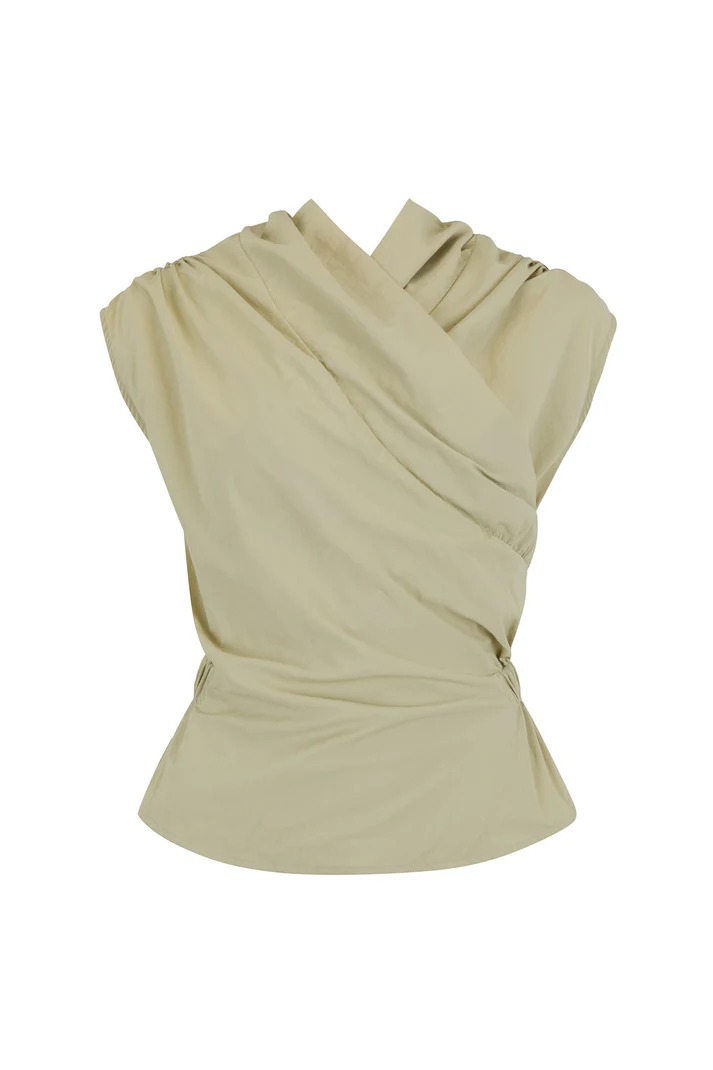
I paired the Cedar Melange trousers with a crisp, sculptural cream top to bring elegance to the relaxed silhouette. The complexity of the color adds quiet interest, while soft cream creates a fresh, polished finish.
Shop My Look
Read on the original site
Open the publisher's page for the full experience